Sales strategies
8 innovative sales dashboard examples you can model

Christine Dzou
Director, Growth Marketing
Published on: July 5, 2023
Last modified on: March 4, 2026
When you set off to a destination, you typically use a GPS to guide the way. If you hit a roadblock, you can simply have the GPS reroute your trip to get back on track.
A sales dashboard essentially acts as a “sales GPS.” It can help you determine if your company is on the right path towards hitting its goals, and correct the course if necessary.
With the right sales dashboards, you’ll be able to analyze performance across your sales team and make better decisions. But what kind of dashboards should you create? And what kind of information should you include in one?
In this article, we’ll explain what sales dashboards are and how they can improve your sales process. We’ll also provide a list of sales dashboard examples to help you set up your own.
JUMP TO EACH SECTION TO LEARN MORE:
- What is a sales dashboard?
- 8 sales dashboard examples
- How do you create a sales dashboard?
- Create actionable sales dashboards with Gong
What is a sales dashboard?
A sales dashboard is a tool that helps you visualize key sales data from one place.
Common metrics that you can track include:
- Sales revenue
- Quota attainment
- Conversion rates
- Average deal sizes
- Sales cycle length
With a sales dashboard, you can track your teams’ performance against company objectives and make informed decisions about your sales strategy.
For example, if your reps are struggling to convert opportunities into buyers, you might revamp your sales playbook or provide scenario-based training. Without a sales dashboard, you’re left to figure things out on your own.
8 sales dashboard examples
There’s no one-size-fits-all approach when it comes to sales dashboards. In fact, it’s best to use a range of dashboards to get a clearer picture of your operations.
Here are eight sales dashboard examples that you can model to create your own.
1. Sales manager dashboard
Sales managers have a lot on their plates. While their responsibilities can vary from company to company, they need to track the right sales KPIs to inform their strategies.
A sales manager dashboard helps sales managers monitor key metrics for their entire team and track their performance against sales goals.
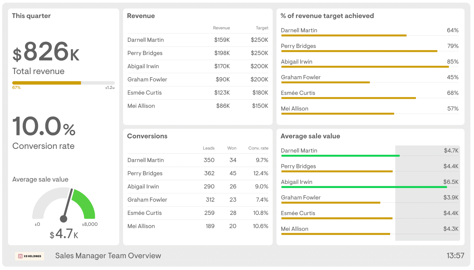
( Image Source )
Relevant KPIs:
- Total revenue
- Conversion rates
- Percent of revenue target achieved
- Average sale value
At a glance, sales managers can see how much revenue each sales rep has generated against their target. They can also see a breakdown of conversion rates and average sale values.
What makes this dashboard valuable is that it can reveal coaching opportunities. For example, we can see that Graham Fowler achieved just 45% of their quota. A sales manager can hone in on their weaknesses and provide personalized sales coaching to help bring their numbers up.
2. Sales activity dashboard
A sales activity dashboard monitors the day-to-day activities of your sales reps. They include things like the number of calls that your reps make and how much revenue they generate.
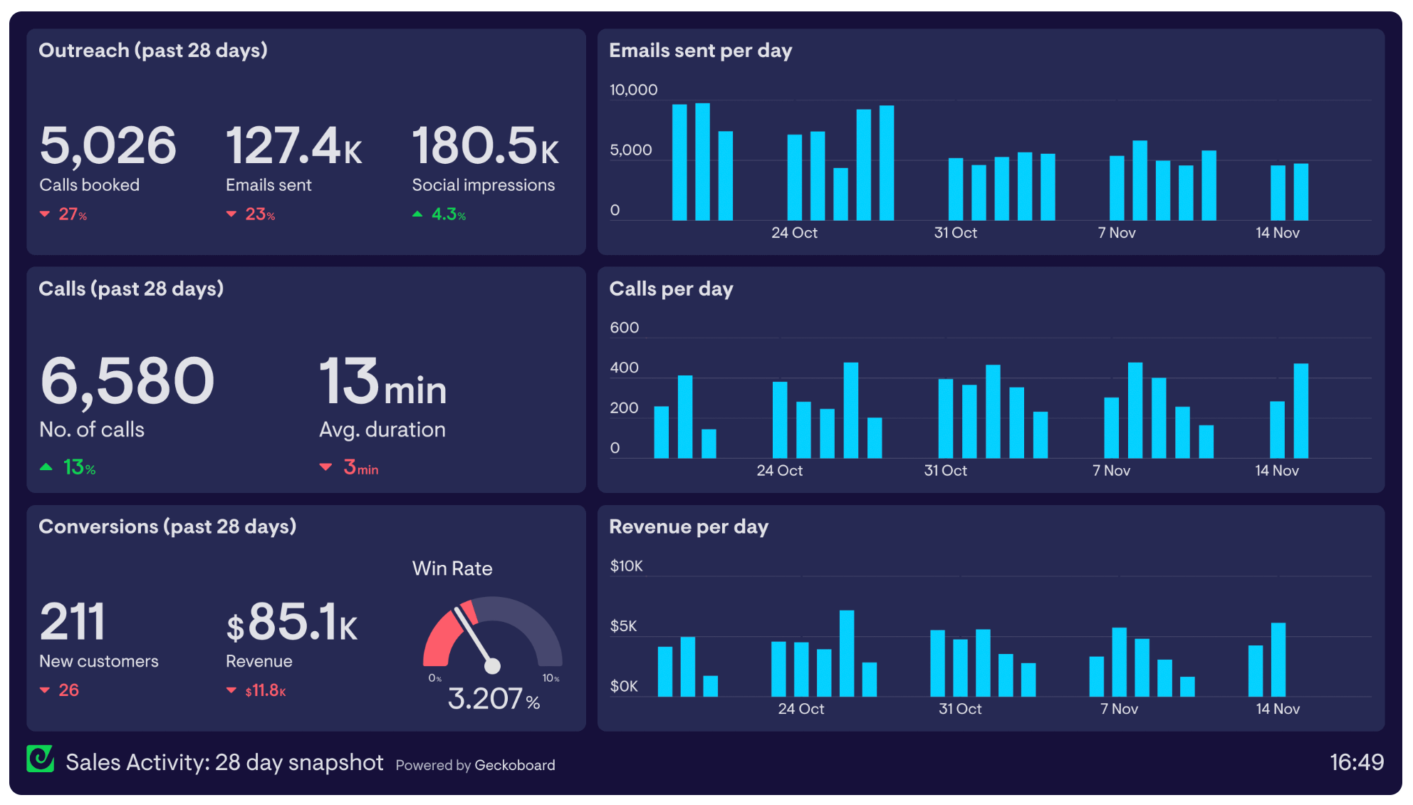
( Image Source )
Relevant KPIs:
- Calls made
- Average duration
- Emails sent
- Win rates
- Revenue
Sales activity metrics are examples of “leading indicators” — data that can help you gauge future performance. If a rep isn’t hitting their targets, looking at their activity metrics might tell you that they’re not making enough calls, in which case you can help them course correct.
Tracking sales activity metrics can also help your reps establish their own benchmarks. They’ll be able to know how many calls they have to make to hit their revenue targets.
3. Sales conversion dashboard
Sales conversion dashboards show how effective your sales team is at moving prospects to the next stage of the sales funnel. They also help you evaluate your sales strategy.
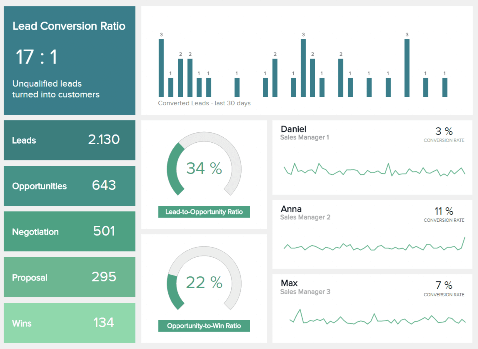
( Image Source )
Relevant KPIs:
- Lead conversion ratios
- Lead-to-opportunity ratio
- Opportunity-to-win ratios
- Conversion rates
Leads don’t always convert — that’s just the nature of doing business. However, a low lead conversion ratio could indicate a poor lead qualification process.
Revamping your sales qualification process makes sure that your reps are focusing on prospects that are more likely to convert. Importantly, it can improve lead conversion ratios.
By analyzing conversion ratios for each stage of the sales cycle in a sales performance dashboard, you can pinpoint issues early on and take steps to address them.
4. Sales pipeline dashboard
A sales pipeline dashboard helps you gauge the health and status of your sales pipeline . You can also use them to identify trends as prospects move from one stage to the next.
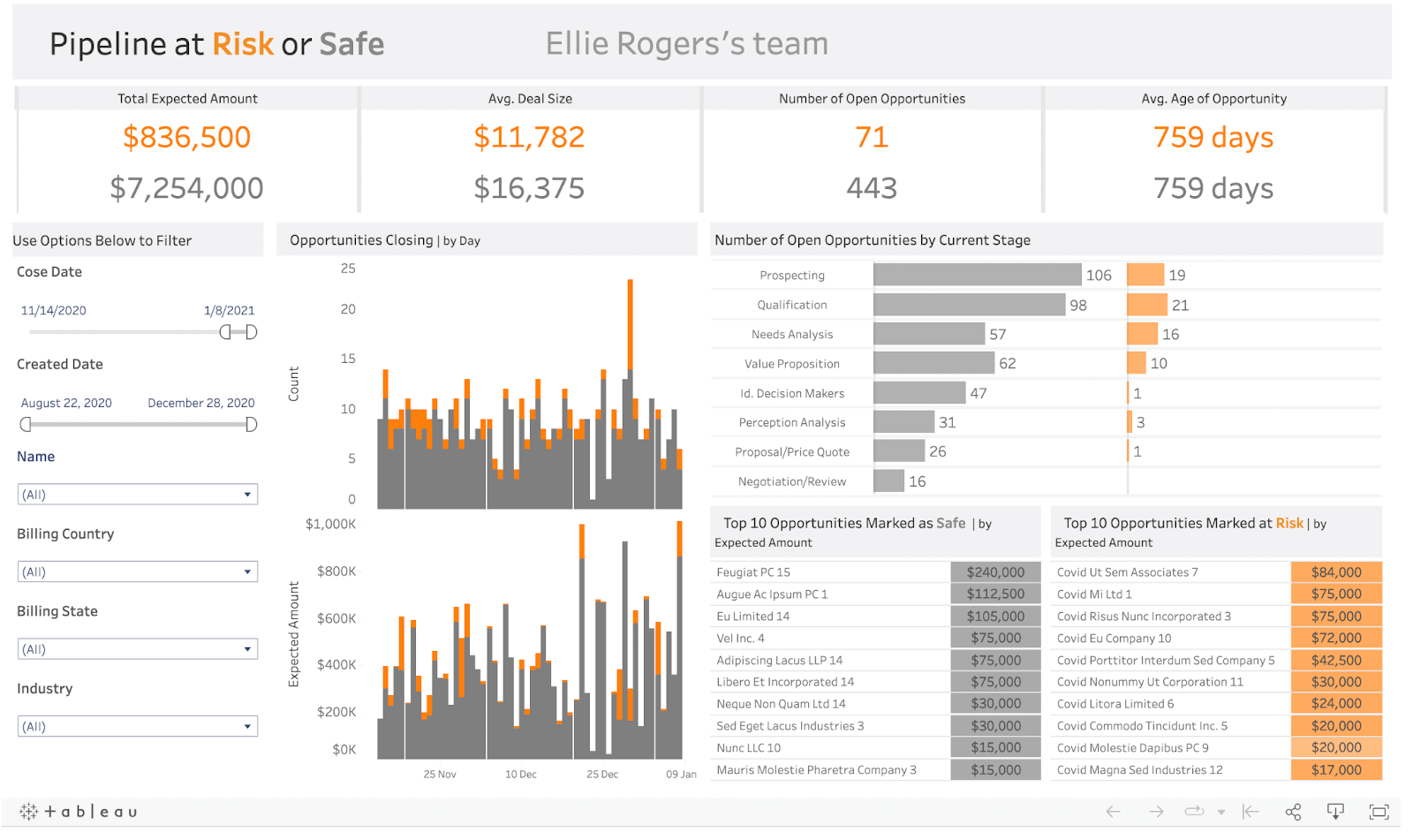
( Image Source )
Relevant KPIs:
- Total pipeline
- Open opportunities
- Average deal size
- Opportunities by stage
- Opportunities marked at risk
A sales pipeline dashboard gives you a high-level view of your pipeline. It shows the number of open opportunities in each stage and their estimated value. Full visibility into your pipeline means you can strengthen pipeline reviews and address at-risk deals before it’s too late.
5. Sales opportunities dashboard
A sales opportunities dashboard provides a clearer picture of your opportunities or prospects who are deemed likely to convert.
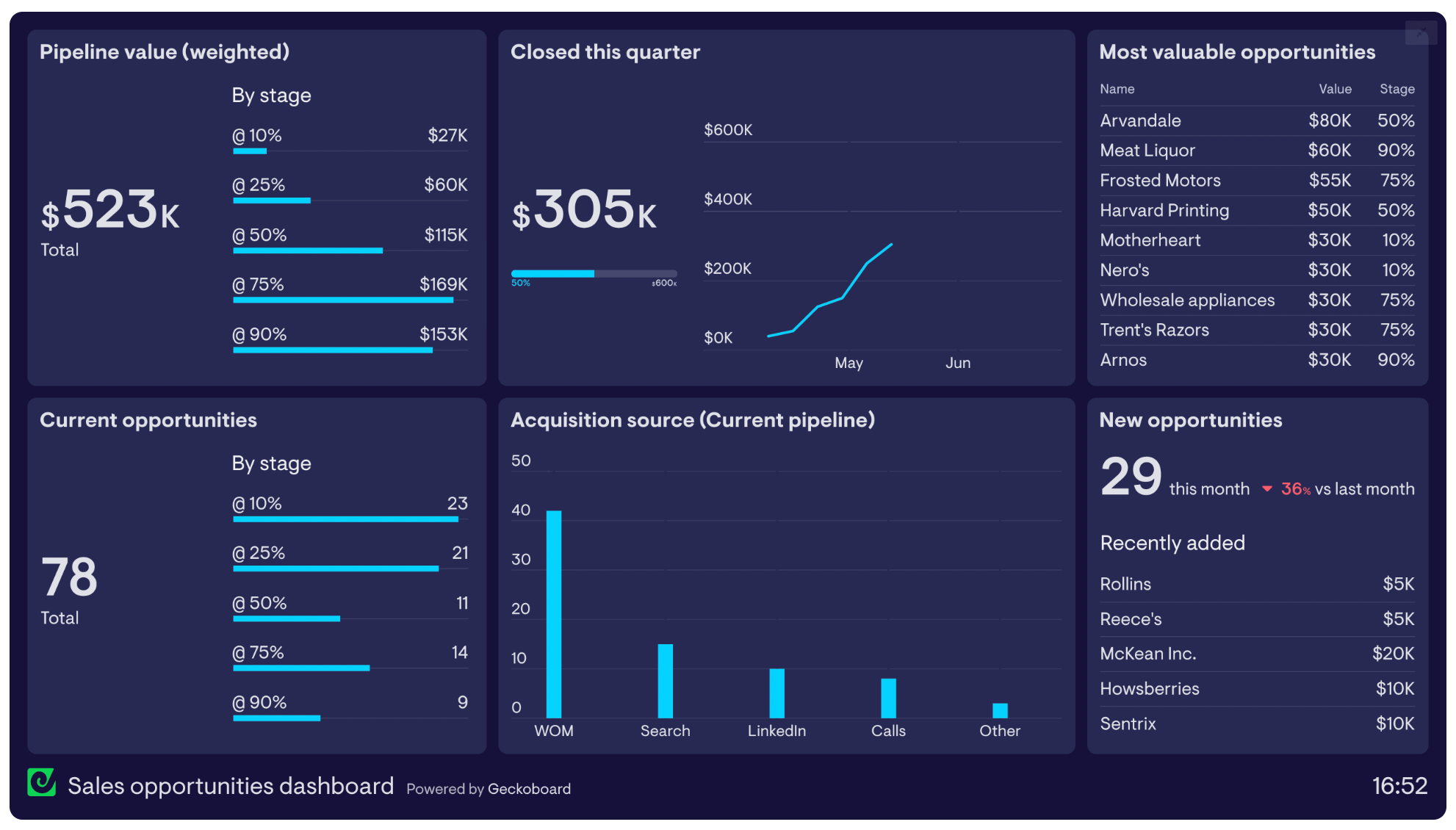
( Image Source )
Relevant KPIs:
- Number of open opportunities
- Value of closed opportunities
- Weighted value by stage
- Acquisition source
This type of dashboard uses “weighting” to estimate revenue. For example, an opportunity in the negotiation stage has a high chance of converting, hence the 90% probability. A $100,000 opportunity at this stage would be valued at $90,000.
Sales opportunities dashboards also typically include a list of acquisition sources. This helps sales managers determine where their most valuable opportunities are coming from.
6. Sales forecast dashboard
A sales forecast dashboard provides an estimate of how much revenue your company will generate in a given period (monthly, quarterly, or yearly). It may also show other relevant metrics like target attainment and pipeline coverage.
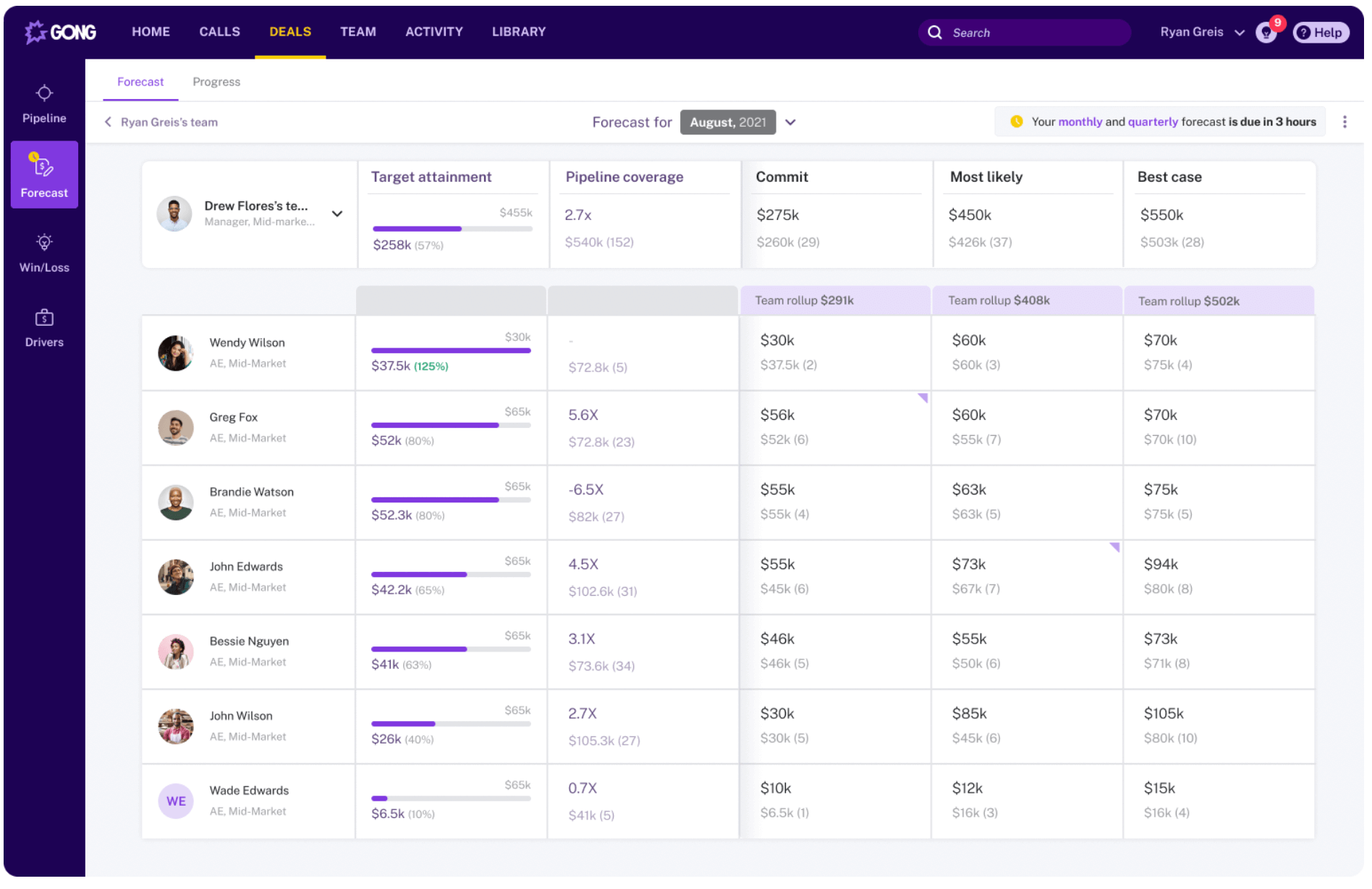
( Image Source )
Relevant KPIs:
- Target attainment
- Pipeline coverage
- Commit
A sales forecast helps companies make informed business decisions.
For example, if you anticipate lower revenue for the next quarter, you may hold off on hiring new staff. But if you expect an increase in revenue, you might consider expanding the sales team or even entering a new territory.
Sales forecasts also help sales managers set realistic quotas. If you expect to generate $500,000 from one territory but $200,000 from another, you can set those targets accordingly without putting undue pressure on your team.
7. Win/loss dashboard
A win/loss dashboard is an invaluable tool for conducting a win/loss analysis — the process of understanding why you won or lost certain deals. Sales leaders and sales managers use these types of dashboards to refine their sales strategy .
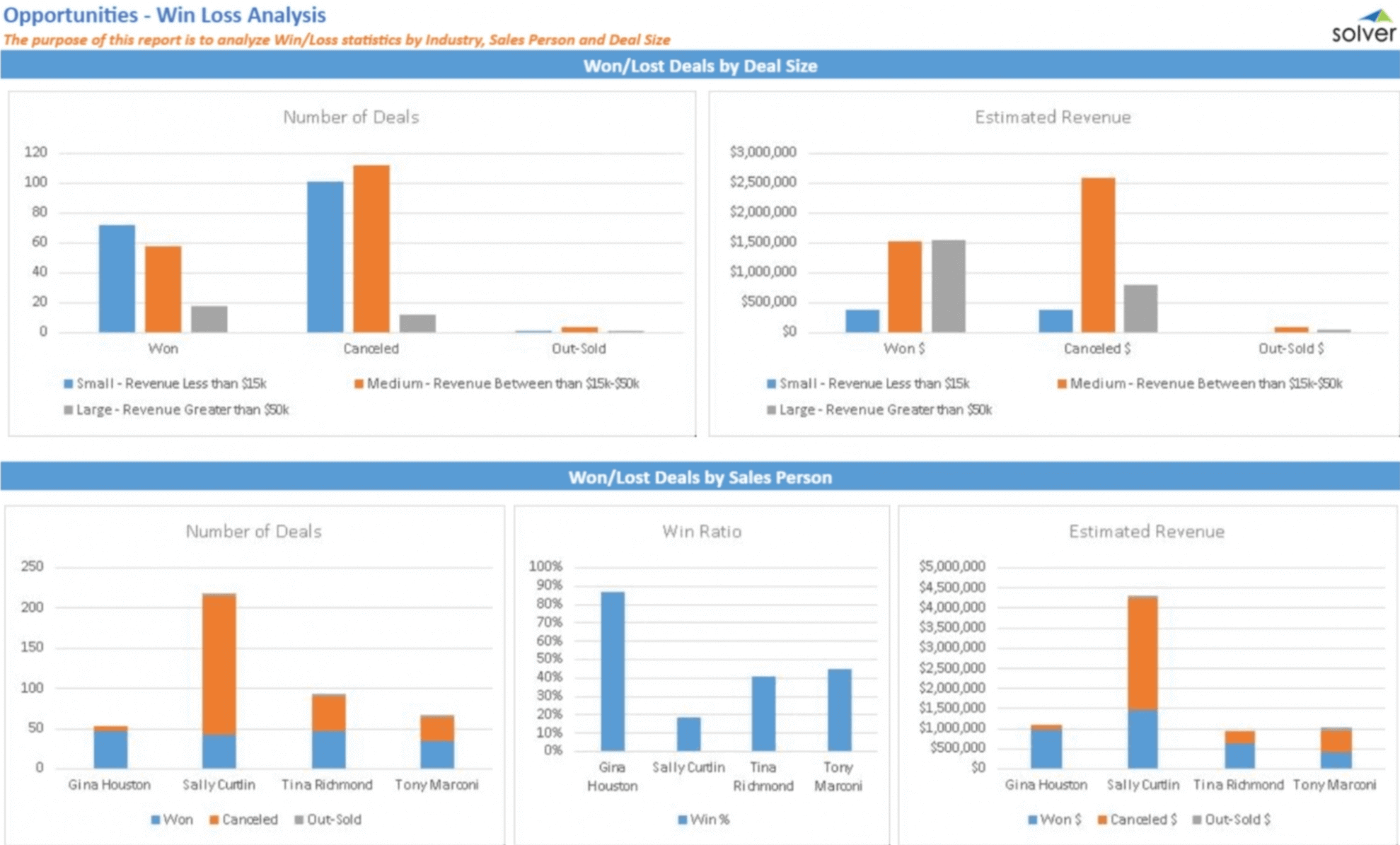
( Image Source )
Relevant KPIs:
- Number of deals won and lost
- Estimated revenue
- Won/lost deals by sales rep
By analyzing won deals, you can identify and narrow down the key criteria for your ideal customer profile (ICP) — a description of the buyers that would benefit from your solution. For example, if your company won more deals from certain industries, you might shift your sales strategy to focus on those verticals.
Likewise, analyzing lost deals can highlight gaps in your sales process. Maybe your messaging wasn’t strong enough or a rep didn’t demonstrate sufficient product knowledge.
Another benefit of a win/loss dashboard is it can help you identify top sales performers and learn what they’re doing differently. With these insights, you can iterate on your sales process and their playbook with the rest of the team.
8. Sales by region dashboard
A sales by region dashboard helps sales managers understand where their company is making the most sales. It provides insights into how well products are performing in certain areas.
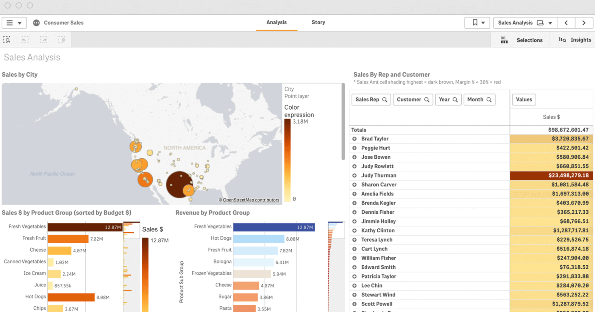
( Image Source )
Relevant KPIs
- Sales by city
- Revenue by product group
- Sales by reps
Products that sell well in one region may do poorly in another. But it’s impossible to know for sure unless you look at the data.
With a sales by region dashboard, sales managers can view sales data for each region and see how certain products are selling. They can also see the reps responsible for each sales territory and how much revenue they’ve generated for the company.
Now that we’ve looked at different examples of sales dashboards, let’s look at how you can create one for your company.
How do you create a sales dashboard?
If you’re not already using a sales dashboard, you’re missing out on valuable sales insights that can help you drive more revenue for your company.
Follow these steps to create a sales dashboard.
Step 1: Determine your target audience
Before you start creating your sales dashboard, you’ll want to determinewhoyou’re creating it for and what they’re trying to answer.
Consider the following:
- Who will use the dashboard?Who is the intended audience? This is important because certain roles will be concerned with specific metrics.
- How often will they check it?How often does the data need to be refreshed? Daily, weekly, or monthly?
- How will they use it? Do they want to measure sales productivity ? Or do they want to evaluate the status of their pipeline?
Knowing the target audience and their purpose will help you determine which KPIs to include in your sales dashboard.
Step 2: Identify the right KPIs to include
There’s no shortage of sales data you can track.
While it’s tempting to fit as many metrics as possible into a dashboard, too much data can overwhelm your salespeople and make it difficult to extract meaningful insights.

Identify which KPIs to include based on the audience you identified in the previous step. Be sure to also consider the questions they want to answer.
Step 3: Gather your sales data
Assuming that you’re already using a sales CRM, you should be able to quickly compile the data you need for the dashboard you’re creating.
Relevance is key here.
Only collect the data that supports the purpose of your dashboard. That means you’ll cut out any “fluff” that doesn’t add value. This will make it easier for the intended audience to gather the insights they need without any distractions.
Step 4: Choose a time period
Ways to track your sales data include:
- Daily:Management teams can use daily dashboards to track activity metrics like the number of calls made, meetings booked, and more.
- Weekly:Weekly dashboards can help you measure performance metrics like conversion rates and total sales per region per week.
- Monthly:For high-level goals, you’ll want to use a monthly dashboard to track outcome metrics like revenue, win rate, and sales cycle length.
- Quarterly:Quarterly dashboards can help you uncover underlying trends and patterns that may not be apparent with shorter timeframes.
Step 5: Illustrate your data
The final data is to pull your data into a sales dashboard.
While you can use Excel or Google Sheets, entering the data manually into a sales dashboard template isn’t the best use of your time. It also increases the risk of human errors, which can skew your data.
The good news is that most sales CRMs support dashboards out of the box, allowing you to visualize key metrics with the data you’ve already been collecting.
Here’s an example of a sales overview dashboard in Zendesk:
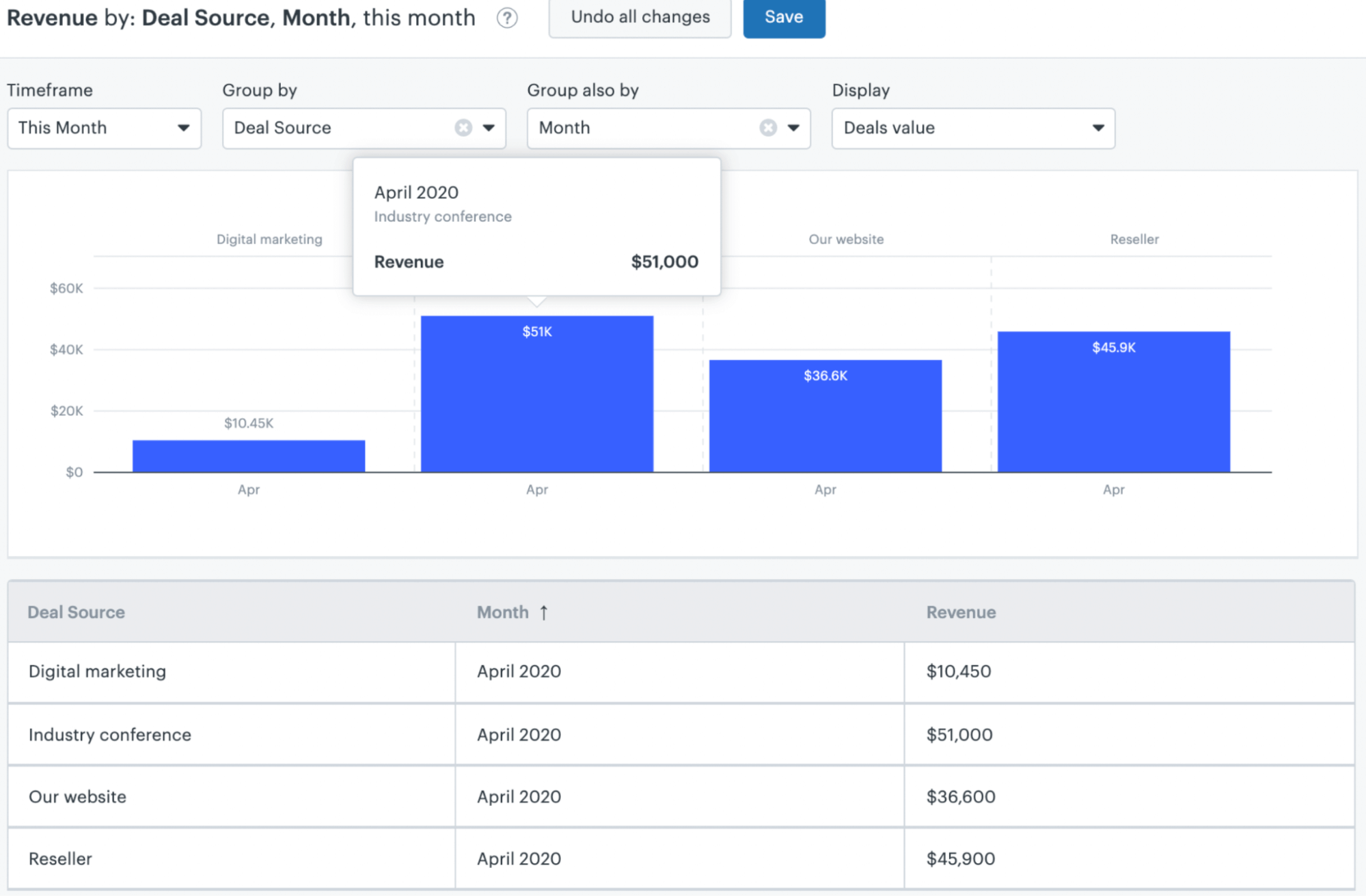
( Image Source )
It displays a column chart of revenue for each month, as well as a breakdown of deal sources.
Using a sales tool like Salesforce, HubSpot, or Pipedrive is one of the simplest and most efficient options for pulling data into a dashboard. You can also connect your CRM tool to sales dashboard software or even a data visualization tool like Tableau.
Create actionable sales dashboards with Gong
Sales dashboards are valuable tools that visualize key sales metrics. Within one view, sales managers can monitor metrics like total revenue, conversion rates, and more. They can use these dashboards to track sales growth and identify issues early on.
Another way to use sales dashboards is to create revenue forecasts.
However, creating a forecast isn’t easy. You have to consider a range of variables to estimate how much revenue you’ll generate. Forecasts are rarely 100% accurate, but poor forecasting can affect decision-making and even sales performance.
Gong’s sales forecasting software eliminates the guesswork in forecasting revenue. It analyzes data points across all interactions to create forecasts based on facts. It also integrates with your CRM, so data like phone calls and emails are tied to your buyer records.
Director, Growth Marketing
Christine Dzou is Director of Growth Marketing at Gong, specializing in web strategy, conversion optimization, and SEO.
With prior leadership roles at Meta and Verkada, she blends data-driven experimentation with scalable growth frameworks to craft high-performing digital experiences that drive demand, engagement, and measurable revenue impact.
Win more with Gong
Loading form...
Discover more from Gong
Check out the latest product information, executive insights, and selling tips and tricks, all on the Gong blog.