Introducing Gong’s New Visual Identity

Udi Ledergor
Chief Evangelist
Published on: October 6, 2021
Last modified on: March 6, 2026
AI Summary
Few things are as comforting as the presence of a dog in the workplace. Dogs greet you at the door, humor you in the conference room, nuzzle you at your desk. They roam the halls like zombies in search of a quick morsel, a friendly glance, a belly rub. Ya, having dogs at work somehow made you forget you were there at all.
Gong embraces the company of dogs as well. But only one dog has remained through the trying times of COVID —one particularly slobbery, extroverted breed of bulldog named Bruno. Now here’s a dog who really knows how to get around. He’s everywhere: on our website, in our advertising, gracing the covers of countless marketing materials, e-books, landing pages and social posts. He’s even made appearances at trade shows. We have pictures of Bruno in golf attire, a shot of Bruno with Santa, versions of him wearing headphones or suiting up to hit the waves. You could say Bruno was our company mascot. He was more than that of course. Bruno was a key part of what made our brand so human and approachable.
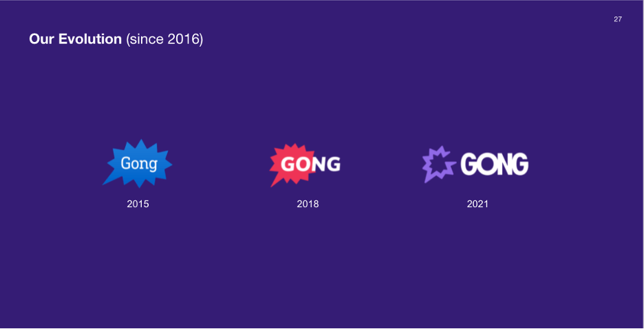
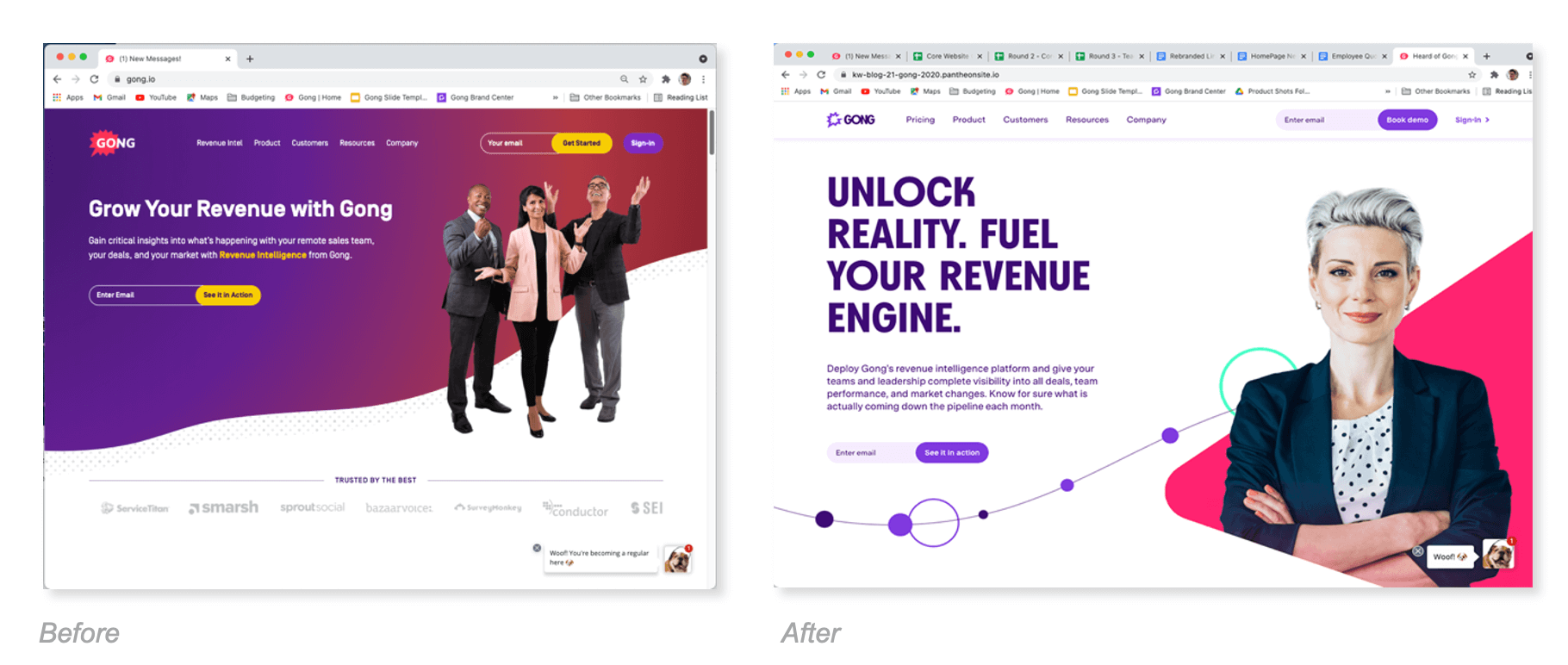
So when it came time to consider a rebrand at Gong, Bruno was one of many symbols that represented our youthful, startup past. Fact is, Gong had grown exponentially the last few years and the business was now considering it’s future as a global enterprise. Sales teams were targeting larger and larger customers, the kind who demand only proven business partners. To sell to this demanding crowd and win upmarket, Gong needed to look more sophisticated. Sure, the team had built a reputation for superior product quality and innovation, dependable customer service and a company-wide dedication to success. But the brand wasn’t fully reflecting this new growth and needed to evolve. Sadly, Old Bruno’s days were numbered.
Or were they? Truth is, Bruno had become something of a metaphor for our success and loyalty to our customers. This gregarious hound gained huge recognition amongst the B2B crowd and was becoming a bit of a legend in social circles. His meaty smile and magnetic gaze were one aspect of the older brand that symbolized Gong’s approachable personality. Our bold, festive graphics and bright colors, hilarious social commentary, useful content and laid back narrative were surprisingly welcomed by the B2B crowd and connected with sales pros everywhere. Make no mistake, Gong is a tech-based platform steeped in deep artificial intelligence and machine learning algorithms. But we never mention these roots in our marketing. Instead, we opted for a radically different, more human-centered go-to-market strategy four years prior: help business professionals everywhere become sales superstars.
This was a surprising strategy for a budding tech brand, and it soon propelled Gong to the unique status of #1 software in business. But as the last few years have shown, Gong unlocks potential not just for individuals and their deals, but of whole teams and companies working collaboratively to own an entire market. When one team member excels, others are quick to adapt and soon, the entire business is succeeding. CROs and even CEOs were taking note. Gong was fast becoming the eyes and ears of revenue leaders everywhere, giving them deep insight into their funnel and team activities. This was something they’never enjoyed with traditional CRM systems.
To properly capture this recent success and project it powerfully up market, Gong refocused its mission statement to better articulate its value and passion:
“We unlock reality to help people and companies reach their full potential.”
But something else was needed. The brand could now talk the language of enterprise organizations, but it didn’t yet look like one. Gong needed a rebrand. To be sure, this didn’t mean losing Bruno, or the bold bright colors and unabashedly human element that helped propel Gong to unicorn status. Bruno had become the Budweiser Bullfrog of B2B, the Ronald McDonald of Revenue. But the solution was obvious. Gong needed a much larger visual system of beautiful, interrelated graphic elements, sophisticated design, ownable imagery, that would combine with the new messaging. This was the natural next step for Gong in its quest for global recognition.
So, weeks later, when 3 beautiful brand systems were presented to the team, one solution clearly stood out from the rest as a masterful work of art: shapes, textures, colors, typography, all converged as this cohesive, impressive personality, the new building blocks of our future DNA. This was the identity system that wowed our designers, transfixed our engineers, amazed our marketers and just seemed so cool. The team rejected it immediately.
Wait… what? Why? As beautiful and masterful as it was, this visual system just wasn’t who we were, or who we wanted to become. Simply put, it was too perfect, too scientific, too made up of manageable little bits of geometric splendor and color that animated beautifully together and just seemed almost formulaic. Gong was much more emotional, visceral, with bold whimsy, unrestrained energy, a human vibe that just wasn’t represented here. The older brand had firmly established that for us.
These congenial, undeniably human qualities we espoused were brought to life more accurately by another of the three options: one that struck you immediately as almost 70’s retro design, a look that pulsed with energy and stopped you in your tracks like a talented street performer. Boy was this getting fun!
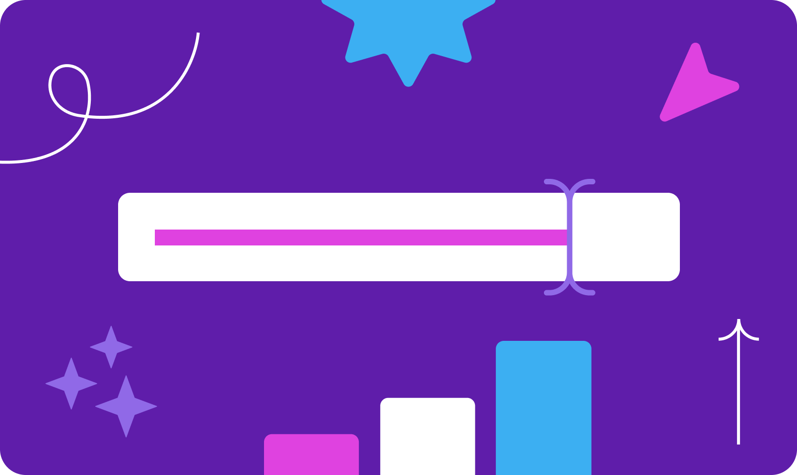
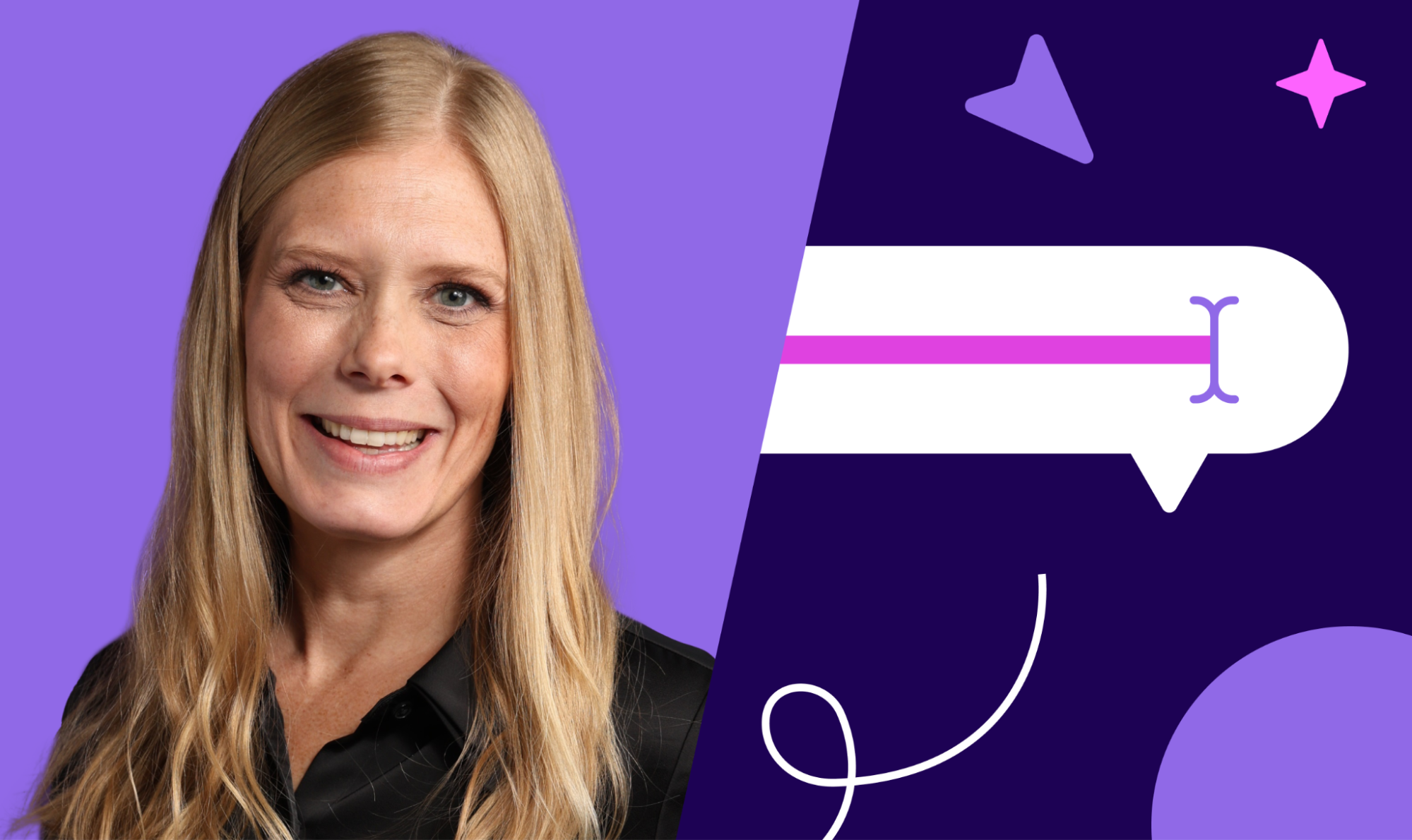
Any good brand framework starts with a logo. Tech brands often start with an obvious metaphor in the mark that conveys a promise or visual story to the viewer. These often seem forced, contrived, disingenuous. The new logo we chose was a celebration of people and it aligned perfectly with our persona. There were our brand drivers, built right into the mark itself. There was Celebration (a vibrant burst of energy), Conversation (the social bubble), Individuality (a unique G shape was conveyed in the mark). The burst was still there, only now it had morphed into a mere outline of its former self, one that represented us more emotionally than before.
Next up was the logotype. When considering a new logo, many tech brands choose a creative, abstract shape to convey creativity and meaning, then combine that with a clean, modern typeface that just gets out of the way. Not Gong. We opted for an equally evocative, whimsical typeface that screamed “let’s party”. The letters were heavy block forms tightly tracked close together like a bunch of college students packed into a phone booth. Mark and type balance together like a wild couple out on the town.
Our new color palette would be just as bold and emotional, consisting of hues of bright purple, flanked by pink, plus shades of gray to help modulate the effect. The thinking with color was that Gong had that right all along. So we chose to keep what had worked so well and refine the palette with splashes of secondary colors. What fun we would have with these.

And where photos of sales folks used to dominate the layout, now sat dramatic illustrations of everyday individuals who’ve been transformed into sales superstars through the thoughtful determination of a pen. They humanized the brand, with their disarming smiles and inspiring gazes. The choice of our new brand characters, as well as the style we chose for the illustrations, are also a nod at our deep commitment to diversity, equity, and inclusion.
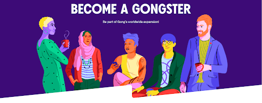
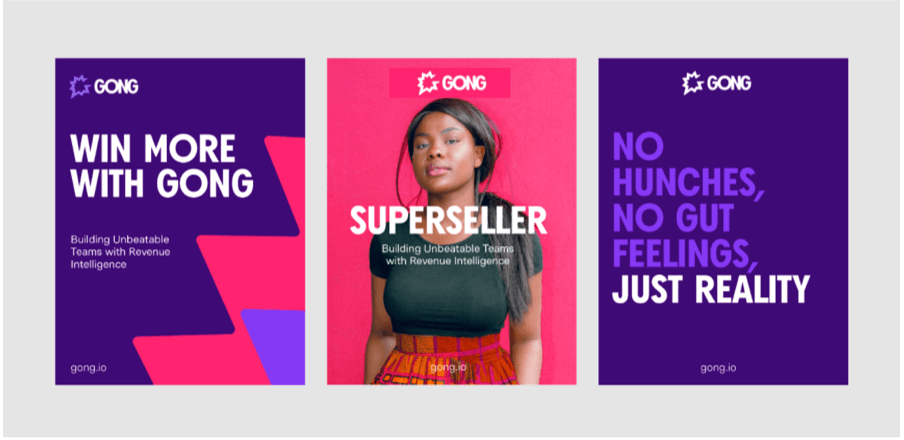
Likewise, the vibrant new visual language of Gong would pull no punches. Our background graphics took their cues from the burst shape, with zigzag angles and juxtaposition of purples, pinks and grays. No way you would walk by a Gong billboard and not take notice. And resting comfortably on this bold background will sit illustrations or photos of proud sales professionals: inspirational people who lead interesting personal lives, and who just happen to be great at sales. Our new brand was complete.
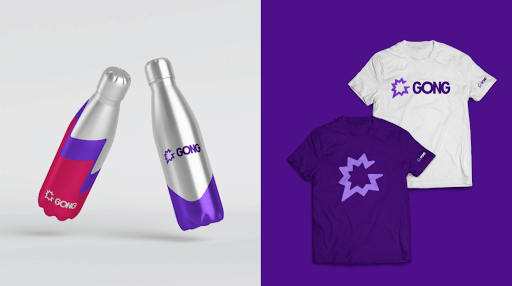
The best sales professionals are, of course, interesting, unique individuals first. They lead meaningful lives, try everything once, and are never afraid to be themselves. And they love a good challenge almost as much as they love people. This new brand was just the spark Gong needed to show our friends and the world that Gong understood them. And we’re showing our gratitude with an online Gong Gear store showcasing cool new branded merchandise ideas that reflect the new brand. Feel free to check out the store .
Our passion is transforming regular business folks into sales superstars everywhere. With new emphasis on messaging, a commitment to our partners and an all new identity system to wear, we’re taking this party global.
As for Ol’ Bruno, he’s getting on in his years. Yet he can still be found most days fetching leads from various parts of the Gong website, or greeting you enthusiastically from the chatbot. Bruno is a part of us, a symbol of this evolving brand and a constant reminder that we are here to serve our loyal customers. So in the coming months and years, as we continue to grow, customers should expect nothing less than the same dependable service and dedication to success, same commitment to innovation and to delivering great products. Only now, our brand would better convey that growth and purpose as we continue to serve thousands of the world’s most successful enterprises across industries and geographic regions.
Bruno, welcome to Gong’s next chapter.
Win more with Gong
Loading form...
Discover more from Gong
Check out the latest product information, executive insights, and selling tips and tricks, all on the Gong blog.